

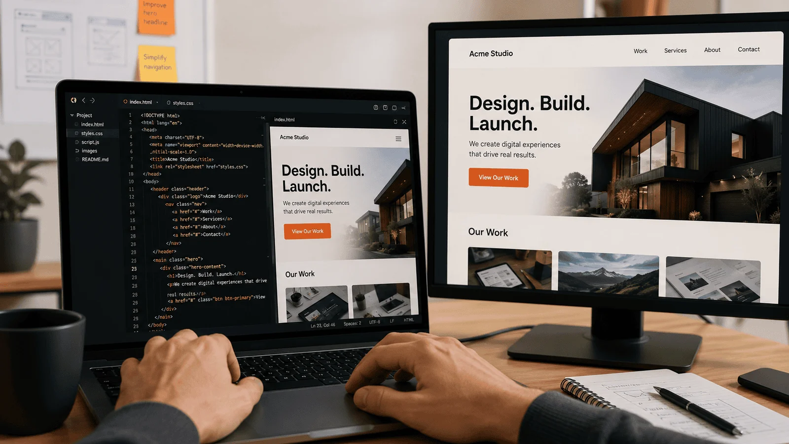
Responsive design and mobile-first design get used interchangeably, though a meaningful distinction still exists between them worth understanding for informed design decisions.
Responsive Design Starts From Desktop and Adapts Downward
Traditional responsive design begins with a desktop layout, then adapts and simplifies for smaller screens — a design philosophy that can produce compromises when mobile becomes an afterthought adaptation.
Mobile-First Starts From the Most Constrained Experience and Builds Up
Mobile-first design begins with the most constrained mobile experience, then progressively enhances for larger screens, a philosophy that forces prioritization decisions responsive design sometimes avoids.
The Practical Difference Shows Up in Priority Decisions
Mobile-first's constraint-first approach tends to produce more disciplined content and feature prioritization than responsive design's tendency to simply shrink and rearrange desktop content for smaller screens.
What This Means for Design Approach Choice
Given current mobile traffic dominance for most businesses, mobile-first's disciplined prioritization approach generally produces better practical outcomes than traditional desktop-first responsive design.
Want a website designed mobile-first from the ground up? Website Development
How Performance Implications Differ Between These Two Approaches
Mobile-first design's constraint-driven approach naturally tends toward better mobile performance, since content and functionality decisions get made with mobile limitations in mind from the start rather than retrofitted afterward.
This performance advantage matters because retrofitted mobile experiences, however responsive in layout terms, often carry unnecessary weight from desktop-oriented content and functionality that wasn't reconsidered for mobile constraints.
Why Content Strategy Differs Between the Two Approaches
Mobile-first design forces earlier, more disciplined content prioritization decisions, while responsive design can allow content bloat to persist since desktop space doesn't create the same natural constraint pressure.
How Team Workflow Differs When Designing Mobile-First Versus Responsively
Mobile-first design requires designers and developers to think through mobile constraints first in their actual workflow, a process discipline that responsive design's more flexible starting point doesn't naturally enforce.
Why Legacy Responsive Sites Don't Always Need Full Mobile-First Rebuild
A well-executed responsive site, even if not built mobile-first originally, can perform adequately if deliberate attention was paid to mobile experience during development, making the distinction more about process than absolute outcome quality.
A Reasonable Way to Evaluate Whether Your Current Approach Serves Users Well
Testing your actual mobile experience directly, rather than assuming responsive layout automatically means adequate mobile quality, reveals whether your current approach serves mobile users well regardless of which design philosophy was originally used.
How Touch Interaction Design Differs From Pure Screen Size Adaptation
Mobile-first design considers touch interaction patterns \— tap target size, gesture support \— from the start, while responsive design sometimes treats mobile purely as a smaller screen size problem without addressing interaction method differences.
This distinction matters because touch interaction has different usability requirements than mouse-based interaction, and a responsive site that only adapts visual layout without considering these interaction differences can feel awkward despite technically fitting the smaller screen.
Why Progressive Enhancement Philosophy Underlies Mobile-First Thinking
Mobile-first design embodies progressive enhancement — starting with essential functionality and adding enhancement for capable devices \— rather than graceful degradation from a full-featured desktop starting point.
How Team Skill Requirements Differ Between These Two Design Approaches
Mobile-first design requires designers comfortable making difficult prioritization decisions early, a skill set distinct from responsive design's more flexible, adaptation-focused approach.
Why Business Context Should Inform Which Approach Better Fits a Specific Project
A business serving primarily desktop-based professional users in specific contexts might reasonably prioritize differently than a consumer business with dominant mobile traffic, making context-specific evaluation more useful than universal rules.
A Reasonable Way to Audit Whether an Existing Responsive Site Needs Mobile-First Reconsideration
Reviewing mobile-specific analytics and user feedback reveals whether current responsive implementation serves mobile users adequately or whether mobile-first reconsideration would meaningfully improve actual outcomes.
Why Image and Media Handling Differs Between the Two Approaches
Mobile-first design defaults to smaller, optimized media that scales up for larger screens, while responsive design sometimes loads full desktop-sized media that gets visually shrunk without file size reduction.
How Font and Typography Scaling Should Be Handled Thoughtfully Across Devices
Mobile-first typography starts with readable, appropriately-sized text for small screens, then scales up thoughtfully, rather than shrinking desktop-optimized typography down to potentially illegible mobile sizing.
Why Navigation Design Differs Fundamentally Between Mobile-First and Responsive Approaches
Mobile-first navigation designs for constrained screen space and touch interaction from the start, often producing different navigation patterns than responsive design's adaptation of desktop navigation structures.
Why Testing Strategy Should Include Real Devices, Not Just Browser Emulation
Testing on actual mobile devices, not just desktop browser emulation of mobile screen sizes, reveals interaction and performance issues that emulation alone often doesn't fully surface.
Key Takeaways
- Responsive design starts from desktop and adapts downward, while mobile-first starts from mobile and builds up.
- Mobile-first's constraint-first approach tends to produce more disciplined prioritization than responsive design's tendency to shrink desktop content.
- Given current mobile traffic dominance, mobile-first generally produces better practical outcomes for most businesses.
- Mobile-first design naturally tends toward better mobile performance since decisions are made with mobile limitations from the start.
- A well-executed responsive site can still perform adequately if deliberate mobile attention was paid during development.
Frequently Asked Questions
Is there still a difference between responsive and mobile-first design?
Yes — responsive starts from desktop and adapts down, while mobile-first starts from mobile and builds up.
Does mobile-first design produce better performance?
Often yes — decisions made with mobile constraints in mind from the start avoid unnecessary desktop-oriented weight.
Does content strategy differ between these two approaches?
Yes — mobile-first forces earlier, more disciplined prioritization than responsive design's more flexible starting point.
Do all responsive sites need a full mobile-first rebuild?
Not necessarily — a well-executed responsive site with deliberate mobile attention can perform adequately.
How can we tell if our current site serves mobile users well?
Testing actual mobile experience directly reveals quality regardless of which design philosophy was used.
Does mobile-first design consider touch interaction differently than responsive design?
Yes — mobile-first considers touch patterns from the start, while responsive sometimes treats mobile as just a smaller screen.
Does mobile-first design embody progressive enhancement philosophy?
Yes — starting with essential functionality and adding enhancement, rather than degrading from full-featured desktop.
Do these two approaches require different design team skills?
Yes — mobile-first requires comfort with early prioritization decisions distinct from responsive's flexible approach.
Should business context inform which approach to use?
Yes — context-specific evaluation is more useful than universal rules given different traffic patterns.
Does image handling differ between mobile-first and responsive design?
Yes — mobile-first defaults to optimized media, while responsive sometimes loads oversized desktop media.
Does typography scaling differ between mobile-first and responsive design?
Yes — mobile-first starts with readable mobile sizing and scales up thoughtfully.
Does navigation design differ between the two approaches?
Yes — mobile-first often produces different patterns designed for touch and constrained space from the start.
Should we test on real devices, not just browser emulation?
Yes — real device testing reveals interaction and performance issues emulation alone often misses.
Should design mockups be created mobile-first, not desktop-first?
Yes, ideally — starting mockups from mobile constraints keeps design discipline throughout the process.
Does browser support differ between the two approaches?
Not significantly — both rely on similar underlying CSS techniques, though implementation philosophy differs.
Should we retrain designers who are accustomed to desktop-first thinking?
Yes, often — shifting to mobile-first requires a deliberate mindset shift for experienced desktop-first designers.
Does mobile-first design require a different QA testing checklist?
Yes — QA should prioritize mobile scenarios first given the design philosophy's core focus.
Should performance budgets be set specifically for mobile page weight?
Yes — explicit mobile performance budgets keep the team accountable to mobile-first discipline over time.
Should content editors also understand mobile-first principles?
Yes — content decisions affect layout, making shared understanding across roles valuable.
Does mobile-first design affect load time perception, not just actual metrics?
Yes — users perceive faster loading when the mobile-optimized experience feels responsive from the start.
Should we prototype critical user flows on mobile before desktop?
Yes — this surfaces mobile constraints early, before desktop assumptions shape the flow unnecessarily.
Does mobile-first thinking apply to internal tools, not just public websites?
Yes — internal tools benefit from the same disciplined prioritization mobile-first thinking encourages.
Should we set a specific mobile page weight budget in kilobytes?
Yes — a concrete numeric target holds the team accountable to mobile-first performance discipline.
Should we review analytics for device-specific bounce rate differences?
Yes — significant gaps between mobile and desktop bounce rates often reveal mobile experience issues.
Should we sunset old desktop-first legacy code as part of a mobile-first transition?
Yes, gradually — removing outdated desktop-only assumptions simplifies long-term maintenance.